What Do Top SaaS Websites Have in Common?

It’s safe to say that B2B buyer preferences have changed substantially over the past few years. The question is: are companies’ websites changing with it?
- Are they showing the product instead of telling prospects about it?
- Are they making it easy for prospects to determine if it's within their budget?
- Are they making it simple to schedule a demo to see the product?
To find out, we teamed up with Chili Piper to review the top 100 B2B SaaS websites based on data provided by Peer Signal.
Below, we share how these companies shook out in terms of buyer best practices.
What makes SaaS websites stand out?
The best SaaS websites prioritize the buyer experience.
Today’s buyers want easy access to product information. They want to get their hands dirty in the tool. They want to know right away if the tool is in their budget range. And when they finally have to talk to sales, they want to be able to schedule a meeting immediately.
B2B buying has a long way to go in this department but is making some progress. We found that companies are adopting public-facing, but were underperforming with direct product access through interactive demos and calendar schedulers:
- 57% have public pricing
- 17% have interactive demos
- 11% have calendar schedulers
Below we take a look at the SaaS companies from this list that were following these best practices and share how they created frictionless buying experiences from their website.
How SaaS websites use calendar schedulers
Normally, prospects that want a demo have to fill out a lengthy form, wait for a response, and communicate with a BDR to find a good time to meet. This process can take days, even weeks.
A calendar scheduler eliminates that back and forth, giving prospects the opportunity to book a time with sales when it’s convenient for them. As soon as a meeting is scheduled, the prospect and rep automatically get a confirmation and see it on their calendar.
Majority used calendars behind a form on the Get a Demo page
A majority of the 11% of companies that used calendar schedulers put them behind their existing book a demo form. That way, they can still qualify leads and send them to the appropriate rep based on the prospect’s product interests, region, or vertical.
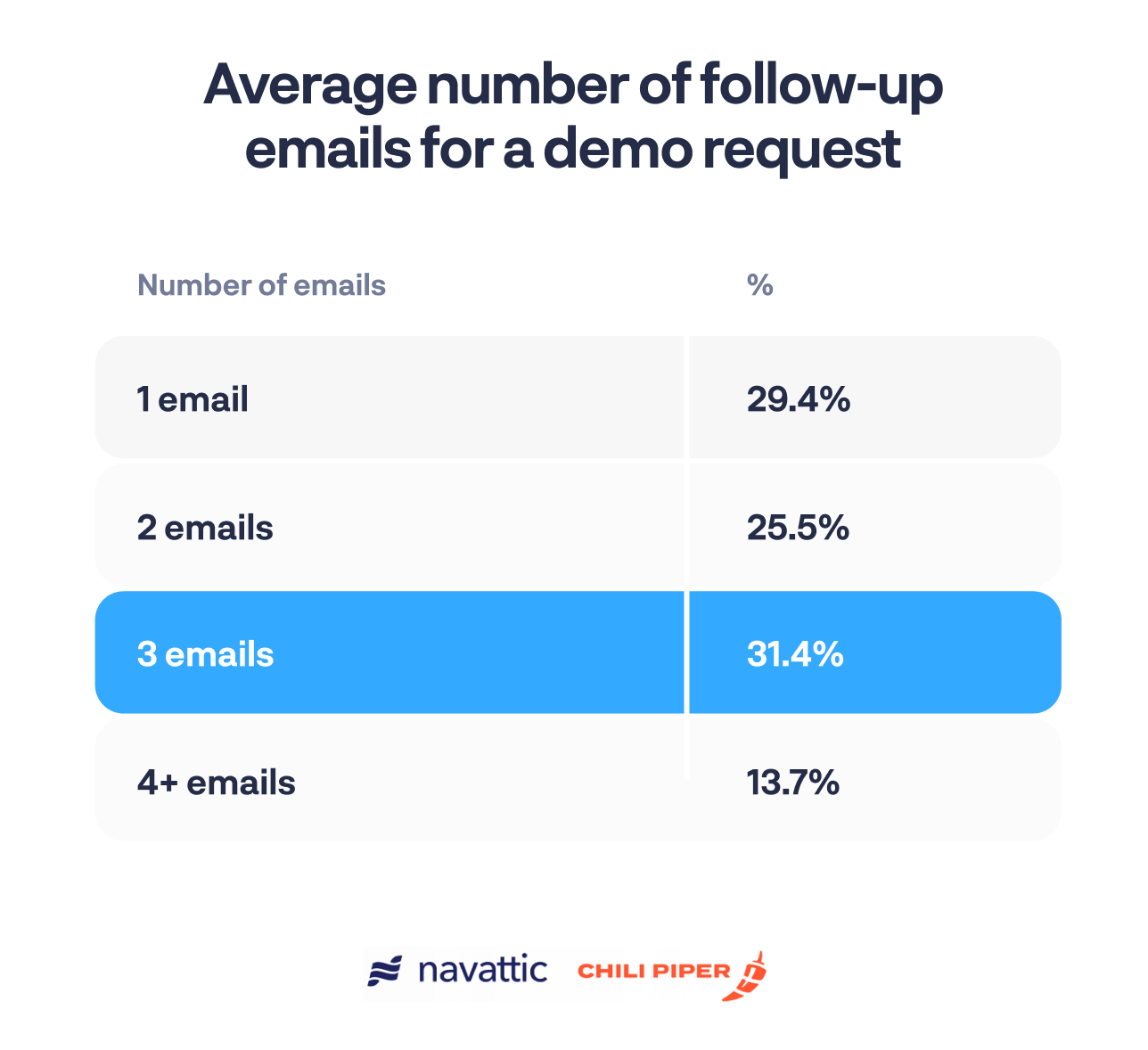
Majority of the time an SDR reached out over email as a first touchpoint
The companies that used a calendar scheduler had a much quicker response time — usually 1 day.
Of the companies that did not use a calendar, 66% of the time an SDR followed up to schedule a demo. If they followed up via email, the cadence was usually 1 to 3 emails:
How SaaS websites use interactive demos
Interactive product demos provide prospects and customers with a hands-on walk-through of a product. Typically a no-code software, interactive demo solutions make it easy for marketers to showcase relevant product features and demonstrate their value.
Interactive demos can be used in email campaigns, as post-demo leave-behinds, or most commonly, on company websites. While they don’t replace a free trial or sales call, interactive demos give potential customers a sneak peek of your product and get them excited to learn more.
Majority included an interactive demo on a specific product landing page
Of the top companies we evaluated, most of them displayed an interactive demo on at least one of their product pages.
Here are just a few examples:
Elastic, the leading platform for search-powered solutions, puts a “Take a tour” CTA front and center on its observability product page.
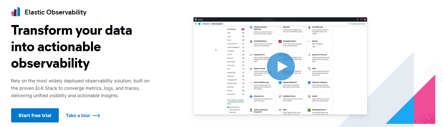
Users who don’t want to commit to a free trial but want more than a static video can opt for the interactive demo.
Cisco’s XDR product is in the complex world of security operations.
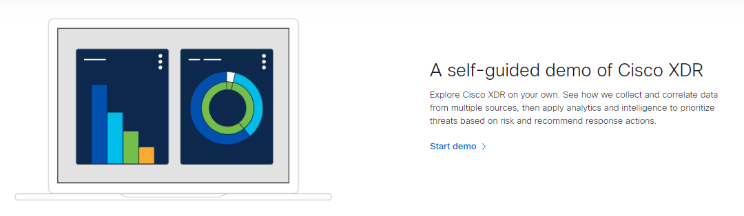
By encouraging visitors to start a self-guided demo, Cisco ensures prospects aren’t overwhelmed by the platform and instead see the kinds of features that will prompt conversion.
Citrix promotes an interactive demo on its security analytics product page as well.
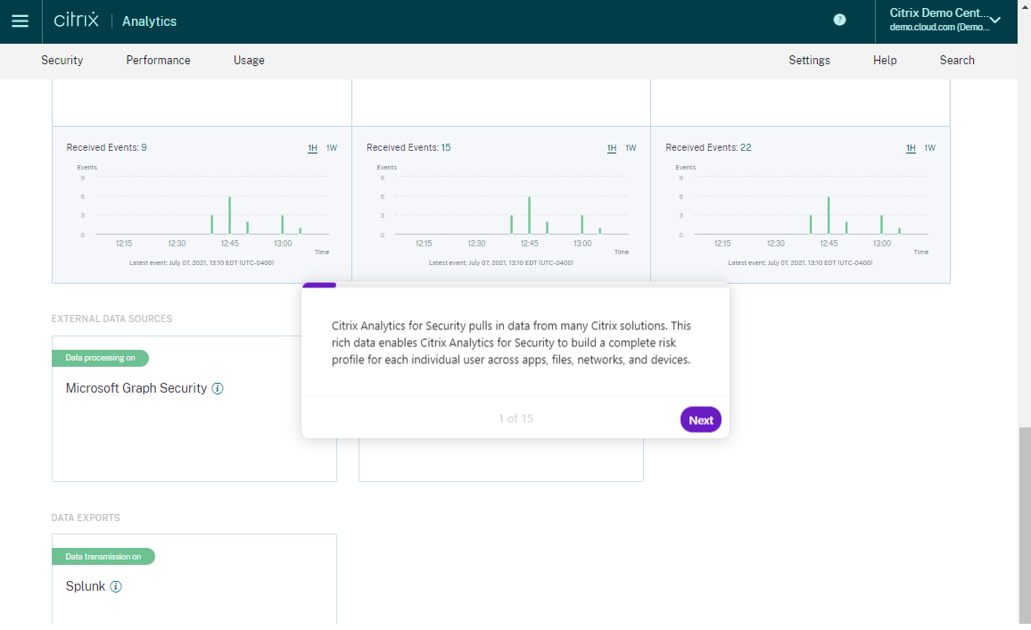
Within the demo, users can see how the Citrix Analytics for Security dashboard looks, learn about geofencing, and prevent internal threats.
Majority had a CTA linking out to the demo
To encourage site visitors to explore their product, many companies linked out to their demo.
This mirrored what we observed in the State of the Interactive Product Demo, 73% of top-performing demo CTAs were visible above the fold via a “Take a Tour” CTA on the website and used one of the following CTAs:
- “Take a Tour”
- “Start Demo”
- “Try It Out”
Majority ungated their demo
Because buyers want to try before they buy, it’s becoming more and more popular to ungate product tours. We saw this trend in our State of the Interactive Product Demo report: 60% of companies left their demos ungated. In this analysis, it jumped to 70%.
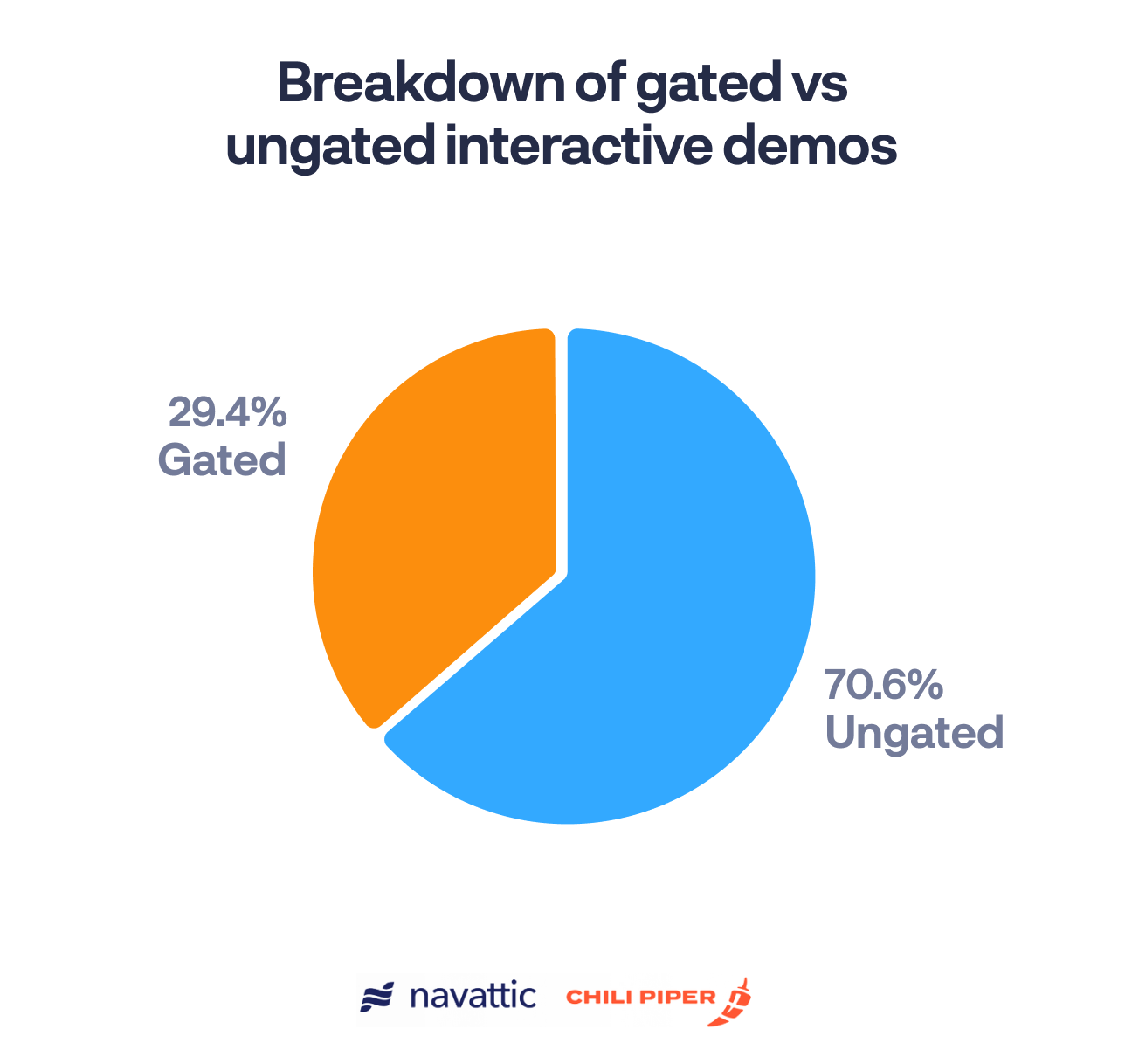
When the demo is a main CTA, it’s more likely to be gated — sales teams want to capture that lead. But if it’s on a product page, it functions similarly to an informational gif or video and doesn’t need to be gated.
How SaaS websites display pricing
Budgets are tight. And if a buyer can’t estimate how much your tool will cost, it’s tough for them to justify sitting through a demo.
Although sales folks are sometimes hesitant to do so, top B2B SaaS companies are adding public-facing pricing to their website, showing what plans and features they offer along with their cost.
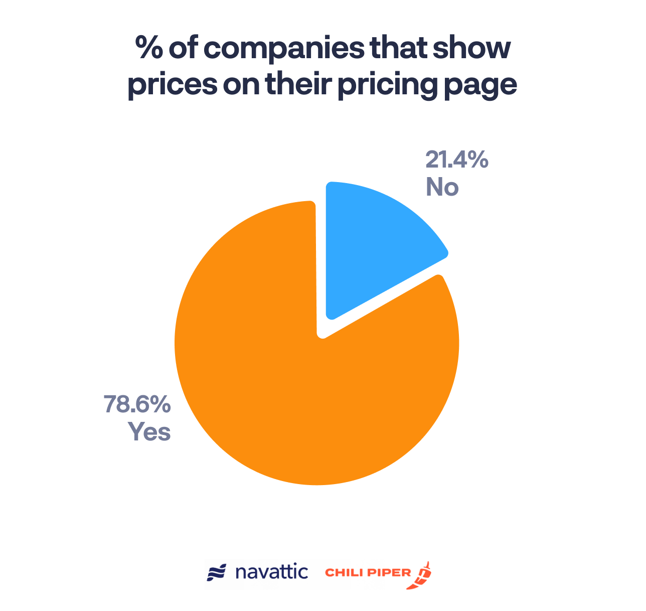
Majority show the actual cost, not just the plan structure
78.6% of companies that had a pricing page showed actual pricing amounts:
Jira, for instance, has an entire pricing calculator:
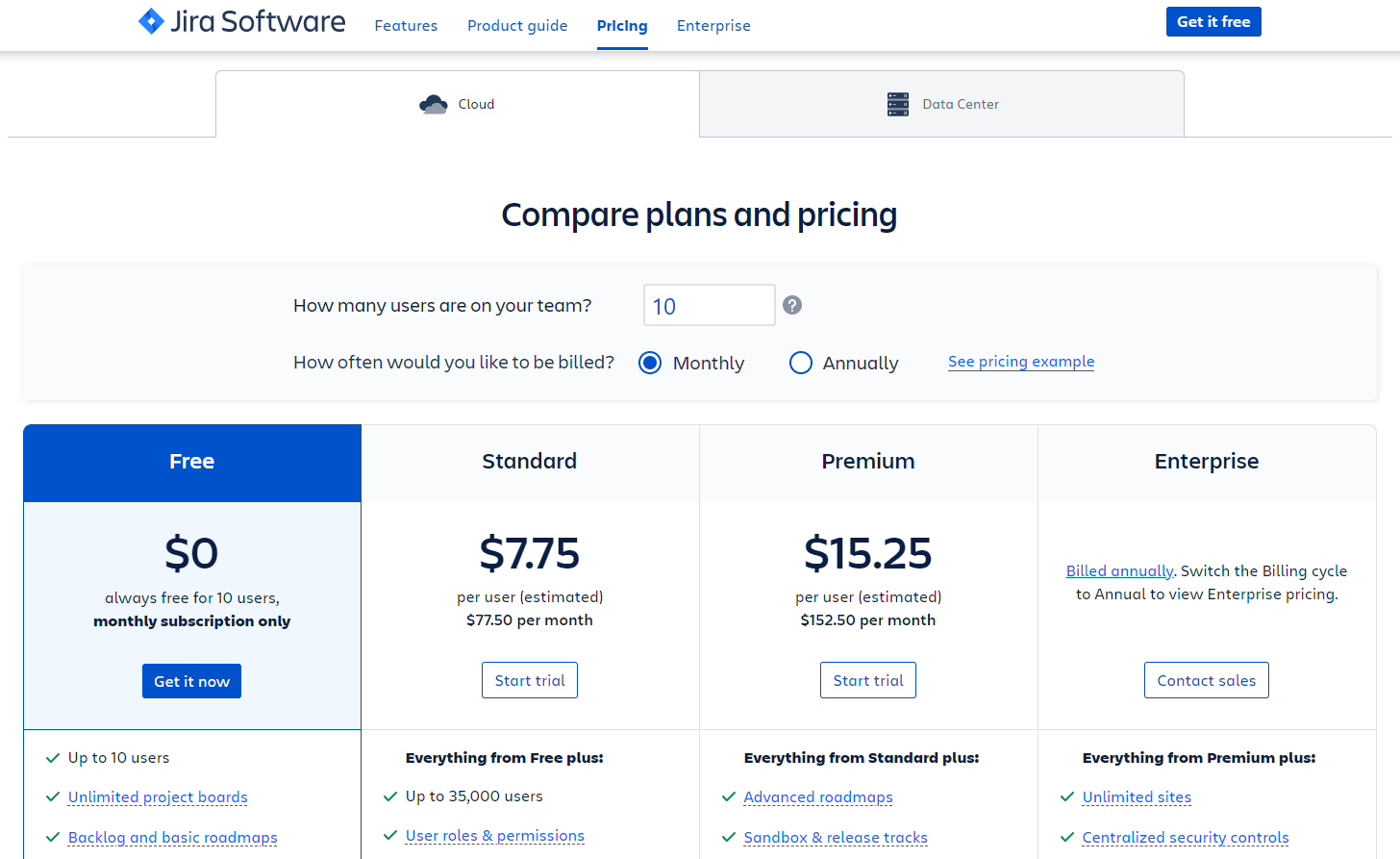
Visitors enter their number of users and their preferred billing structure, and the plans available to them appear, spelling out cost and included features.
Canva takes a similar route, showing plans and pricing based on users and billing cycle.
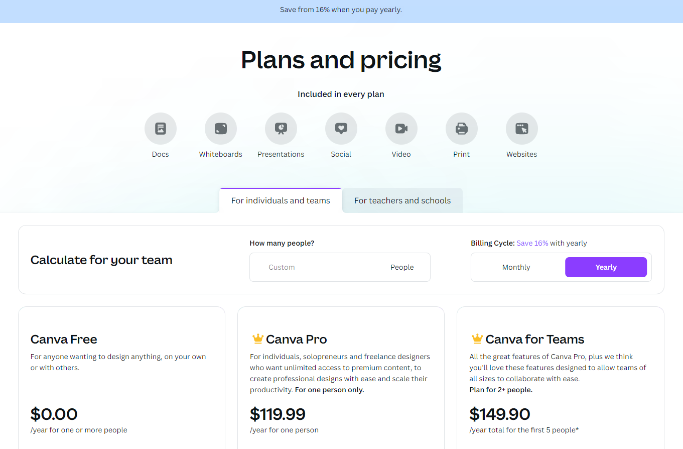
Canva also shows how much users save if they sign up for a yearly subscription.
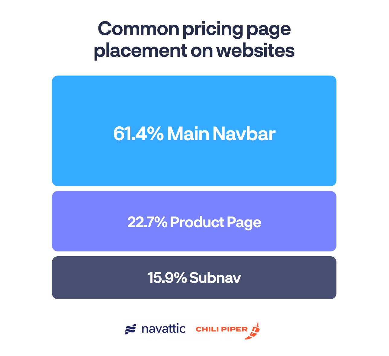
Majority put pricing in the main navigation bar
To make it easy on prospects, companies added a “Pricing” or “Plans” section to their main navigation. Secondary options were listed on the pricing pages themselves or a sub-navigation.
The B2B buying landscape is shifting, and marketers need to find ways to rise to the challenge. To learn more about how you can move the needle, read our full report and check out:
Turn demos into deals.
Build interactive product demos that engage buyers and close deals faster.