How to Increase Conversions For Interactive Demos

How can you boost your interactive demo conversion rate?
In our State of the Interactive Product Demo 2023 report, we pulled data from over 3,000 demos to determine the best ways to leverage interactive demos.
This guide shares three strategies for improving conversion rates and showcases examples of each tactic in practice.
Three simple conversion tips
Three main conversion strategies stood out from the pack: creating short flows with multiple conversion points, placing interactive demos higher on landing pages, and giving visitors several options based on their persona.
1. Keep the intro short and include multiple conversion points
People want to get their hands on your product, but they don’t have all day to see its value.
Short yet impactful flows tend to draw visitors in. In our analysis, we saw that shorter flows had higher completion rates and higher conversion rates.
On average, the first section of demos had 15 steps — most fell within a 10 - 19 step range.
But demos with a shorter first section (5 to 10 steps) had higher completion rates.

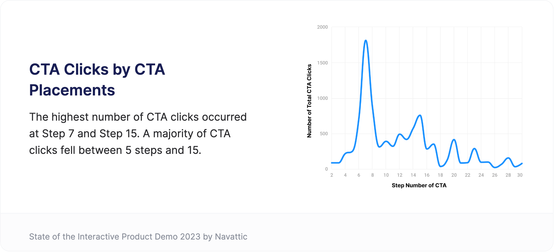
Drilling down, we saw that a majority of CTA clicks fell between 5 and 15 steps. But the highest number of CTA clicks were at Step 7 and Step 15.
Three customers short flow examples
Mixpanel
Mixpanel keeps its introduction to its interactive product tour short and sweet — only 5 steps total.
And they let their users know how many steps are left at the bottom of each tooltip. Here you can see we are on step 2 of 5.
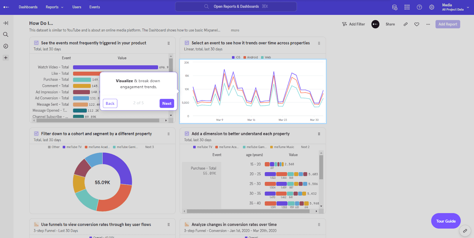
Even though the tour is just 5 steps, it emphasizes Mixpanel’s main benefit — visualizing the user journey via funnel charts and retention graphs. And most importantly, it keeps users wanting more.
At the end of the Mixpanel demo, visitors are asked whether they want to learn more about Mixpanel’s unique advantages in a demo environment or sign up for a free trial.
Dooly also takes the short-and-sweet approach. Their team broke up what could’ve been a very long demo into multiple short ones — each based on a specific feature.

Its demo only has 5 steps but takes users through a relatable, real-life scenario to bring their product to life.
Because the demo is short, visitors are likely to complete it. And because the featured use case is compelling, they’ll likely want to continue engaging with Dooly’s content.
At the conclusion of the 5-step demo, users are prompted to book a demo to learn more about Dooly playbooks.
Klue uses a short interactive demo to plug one of its useful integrations — Microsoft Teams.
Often, integrations are an obstacle to customer success. The difficulty in setting up the integration seems to outweigh the return.
So Klue uses a quick, 7-step demo to convince users of the value of the Teams integration. Not only does it help users collect and track competitive intel, it also motivates their colleagues to share more of it.

Like Mixpanel and Dooly, Klue uses the last step of the flow to encourage users to sign up for a demo.
2. Place the interactive demo embed or CTA high up on the landing page
You can probably guess that people won’t interact with your demo if it’s buried on your website. And our data confirms that hypothesis.
On average, ungated embedded demos had a 24% engagement rate. And demos higher up on the page had 3.5x the engagement rate of those below the fold.

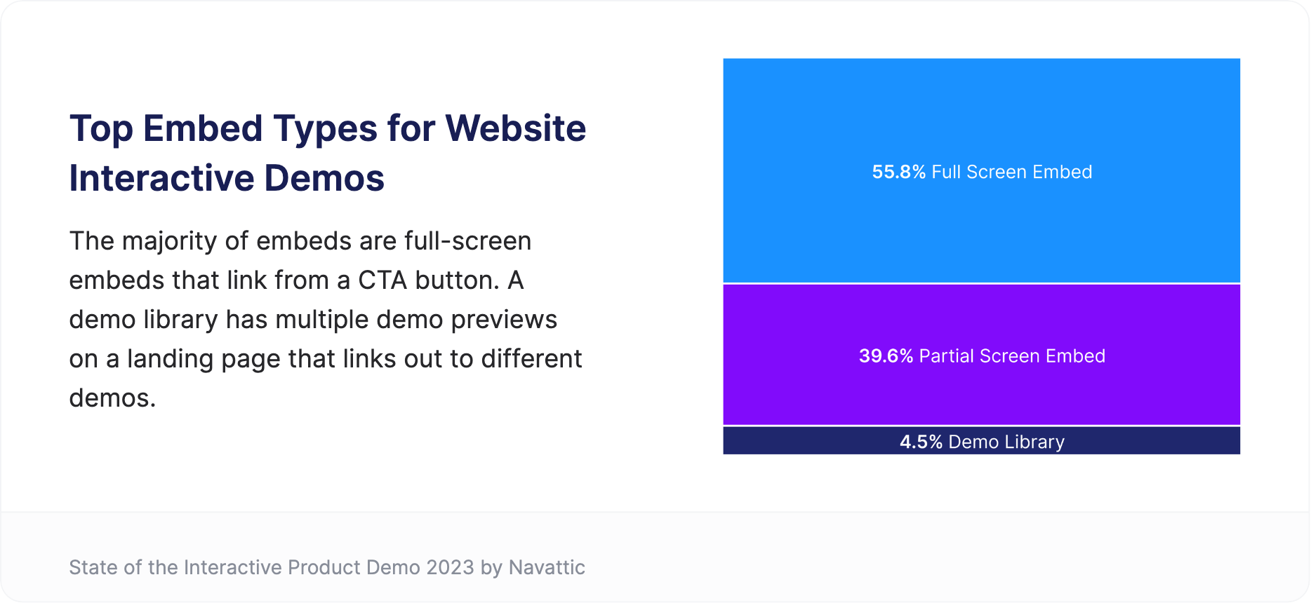
We also found that the majority of embeds are full-screen embeds that link from a CTA button (55.8%), while 39.6% are partial embeds.
So to get users’ attention, we recommend doing one of three things:
- Moving your demo higher up on landing pages or on your homepage
- Adding a CTA to jump users to an embedded interactive demo
- Linking out to your interactive demo with a CTA above the fold or even in the navbar
Three customers examples of higher demo placement
DigitalOcean wants users to sign up for a free $200 credit.
But not every landing page visitor is going to want to sign up right away. They want to see what they are getting first.

So DigitalOcean strategically places a “Take a short tour” CTA to their interactive demo right next to the signup form.
This button jumps users straight to a demo embedded at the bottom of the page.
When users are done with the demo, they’ll better understand how DigitalOcean can help them manage their cloud computing and scroll back up to enroll in a 60-day free trial.
Gorgias puts their product tour front and center; it’s the first element in their navigation bar:

When users click on the Product tour link, they’re taken to a full-screen embedded demo to experience how the Gorgias backend looks and feels.

From there, Gorgias takes visitors through an 8-step overview of managing incoming customer requests, investigating customer orders, and integrating with ecommerce apps like Yotpo and Klaviyo.
Putting the product tour in the Gorgias navigation gets more eyeballs on their demo, which helps to underscore Gorgias’s intuitive UI and robust functionality.
CaptivateIQ advertises its product tour with a button in the navbar, allowing users to go through an interactive demo before booking a meeting with a sales rep.
When visitors click on the “Product Tour” button, they’re immediately taken to an embedded demo above the fold.

At this point, CaptiveIQ can collect information about the potential lead and then show off the product’s best features to drive conversion.
3. If your product serves multiple personas, give users options
Most PLG products cater to multiple personas and solve for multiple use cases. So why not tailor demos to those personas and use cases?
One way to help your visitors get the information they want and need is to add a checklist to your demo. If users are curious about something specific, they can skip straight to the part that pertains to them.
Checklists reduce drop-off by showing users the features that are most interesting to them — quickly. In our research, checklists were shown to increase completion rates on average by 17%.
Another way to cater to your diverse audience is to create a demo library with multiple demos highlighting the features that best suit each ideal customer persona. Visitors can choose the demo that speaks to their use case, getting them to an aha moment faster.
We’re seeing demo libraries rise in popularity. Today, roughly 5% of all customer website demos have a demo library.
Three customers examples of optionality
Ramp incorporates two conversion rate strategies — keeping their demo short and giving users options. After the first eight steps, users are presented with a checklist they can use to dictate the rest of their tour.
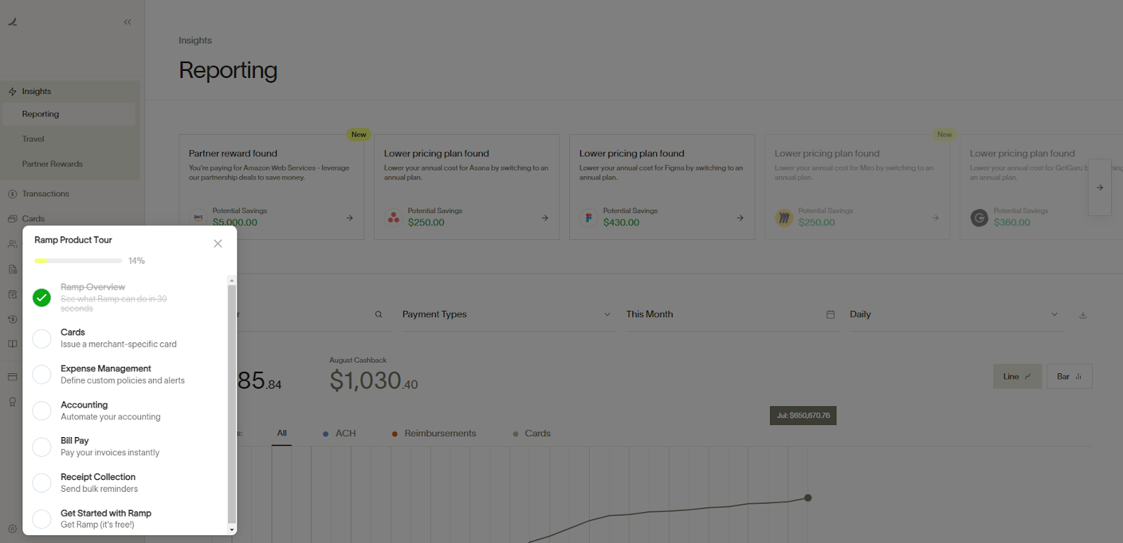
Each item in the checklist relates to roles like Accounting, AP, and AR. When visitors pick the areas of the platform that are most relevant to their job, they’ll be more likely to get started with Ramp’s free trial.
Demandbase dedicates an entire section of its website to self-guided tours.

Demo centers like this one give visitors flexibility with their learning. They can learn about personalization, data integrity, and sales intelligence through the lens of the Demandbase platform.
Visualizing how Demandbase solves these pressing problems can tip the scale toward conversion.
Qualifi
B2B2C tools are great candidates for a choose-your-own-adventure style interactive demo.
Qualifi is a great example — it’s both candidate and recruiter-facing. So the team at Qualifi created two demos: one for a recruiter persona and one for a candidate persona.

When a user lands on the Qualifi product tour, they’re asked whether they want to see the recruiter or candidate experience and are shown a different set of features with a different UI.
This optionality increases the chances that Qualifi shows the right features to the right person, enhancing their chances of conversion.
Curious about what else we found in our research? Read the whole State of the Interactive Product Demo 2023 to learn:
- How long your demos should be
- How to increase demo engagement
- How to raise completion rates
- How to promote your demo
…and more.
Turn demos into deals.
Build interactive product demos that engage buyers and close deals faster.