Customer Show + Tell: Increasing Freemium Sign-ups with Pulkit Sachdeva

About this series:
We spoke with the builders whose interactive demos were part of the top 1% of top-performing interactive demos from our State of the Interactive Product Demo 2024.
See how Pulkit Sachdeva at Chainstack used Navattic to reduce sign-up abandonment for their freemium product.
What is one unique way you've used interactive demos at Chainstack?
When I joined, we began analyzing user behavior and conversion down the funnel. We noticed many were interested in our product offering; they'd visit the website and click the "sign up for free" CTA but wouldn't complete the process.
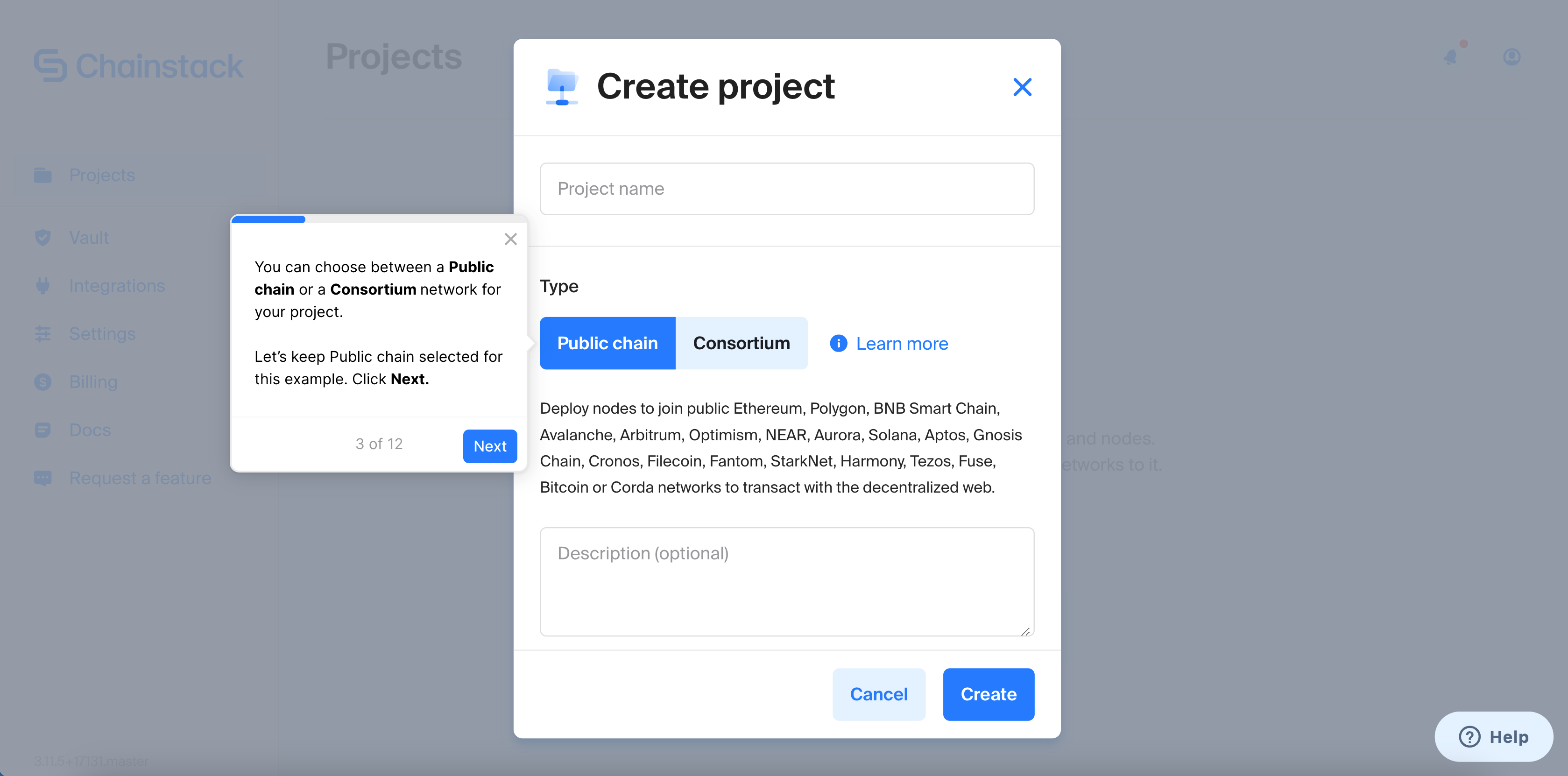
The developers we sell to don't need much selling - they need assurance that our product delivers what it promises. Despite being a freemium product, the sign-up journey included a credit card paywall, leading to a significant drop-off.
There was discomfort in leaving payment info without seeing the product first. This is where Navattic came in; we wanted to give prospects an authentic preview of our product.
That was the one thing I wanted to do — give people a preview of our product and an experience that looked and felt authentic in a way that animations and recorded videos aren't.
I wanted to basically say to my prospects “hey, this is what my product looks like - play around with it and once you're done sign up”.
This approach was our starting point, based on the hypothesis that experiencing the product firsthand would increase sign-ups.
How do you use demos to educate users before and after signing up?
Before the sign-up was the primary use case we started with.
From there, the second use case for using demos was to educate people on any new features we were introducing, especially those that were more coding-intensive or required a greater intellectual investment.
We recently began constructing demos specifically for these features.
How do you go from this idea to building out your website demo?
Drawing from my experience in video production and design, I approach creating demos with the golden mantra: as long as it needs to be, as short as it can be.
I apply this especially to the "as short as it can be" part, being very aggressive with keeping things concise. Assuming you know your product's key desirable outcomes and the actions that activate your users, you should stick to those.
Guide the user from point A to point B without distraction from every shiny object along the way. If the job can be done in 5 steps, then that's all it should take, guiding me through 5 clicks and no more.
It’s like in print media where every word costs. Don't make users click more than necessary to understand and engage with the product from point A to point B.
Did you need to align internally to pinpoint the key moments to highlight?
I'm tied at the hip with product managers, and at Chainstack, we also work closely with developer relationship managers and customer success teams.
They have a deep understanding of what customers do inside the product and what they expect from it, providing insights into user behavior and key desirable outcomes.
For instance, while users might express a need to build apps, monitor metrics, or review daily performance, the core need often boils down to wanting to deploy a blockchain node quickly and return to their coding work, not spending all day in our product.
Identifying the essential outcomes gives us clear direction. There was a lot of internal alignment to understand what the customer behavior looks like but also to get Navattic approved and to determine how we could create value with it.
Was there any concern about the interactive demo cannibalizing freemium users?
The concern wasn't really about cannibalization. In fact, it was quite the opposite.
Considering our audience—smart Web3 developers—we knew they didn't need hand-holding to use the product.
However, they did need reassurance about committing their credit card information to our platform and whether it was worth sticking around.
To overcome this objection, we analyzed our funnel metrics, such as the monthly website visitors, the percentage who clicked on "start for free," and those who never completed the signup process.
By doing some rough, back-of-the-napkin math in Excel from this, incorporating metrics like average lifetime value, we formulated a hypothesis.
For every 1% of people we could re-engage through the demo, we calculated the potential dollar value return.
Since this value was comparable to or slightly more than the subscription cost with Navattic, it made it straightforward to secure approval for incorporating something like this.
What tips do you have for someone who is new to Navattic?
What I mentioned earlier - stick to the golden mantra: as long as it needs to be, as short as it can be. Every word counts.
Another insight from my time at Chainstack and other companies is to incorporate user expectations within your CTAs.
If your demo CTA conveys, "This will take less than five clicks," or "You can complete this in under two minutes," it significantly reduces the cognitive load for users.
Turn demos into deals.
Build interactive product demos that engage buyers and close deals faster.