Best Practices for Building Interactive Demos in 2026

Every year, we analyze all the demos built on Navattic. It helps us identify new and exciting ways people are using interactive demos.
And it also helps us mine best practices for people looking for ways to make their existing demos better.
This year, we reviewed 40,000 demos (a 43% increase from 2025).
In this post, we share what the top 1%, 10%, and 25% of those demos are being used for, how they were built, what they do differently to attract and engage prospects and customers, and takeaways for optimizing your own demos this year.
How Interactive Demos are Used in 2026
Today, roughly 18% of 5,000 B2B SaaS websites have an interactive demo CTA, up from 12% in 2024.
They're being promoted:
On the Website
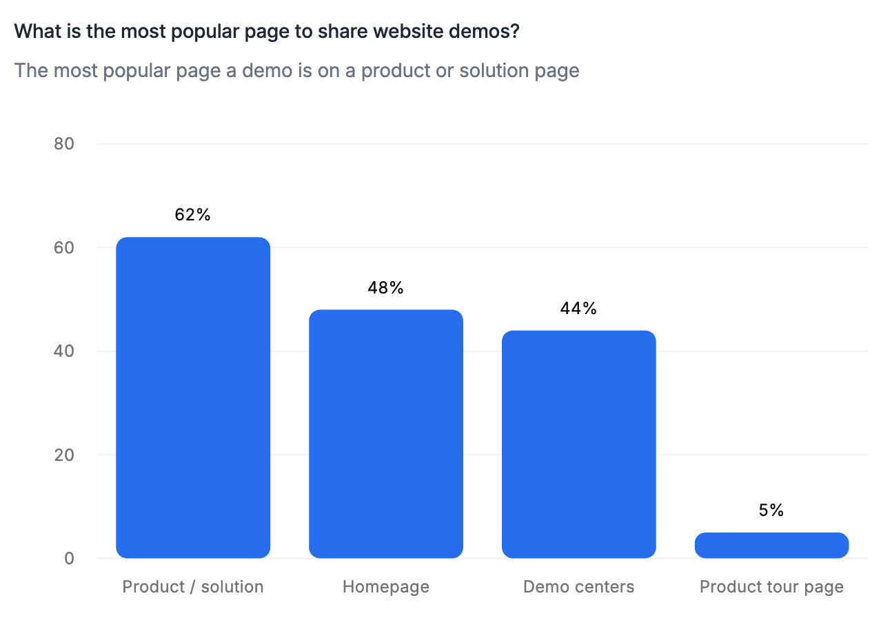
Most interactive demos show up at least once on a company's website. Over half (52%) of the top 1% of demos were placed in multiple website locations, most often on:
- A product or solution page (62%)
- The homepage (48%)
Demo centers are a close third (44%).
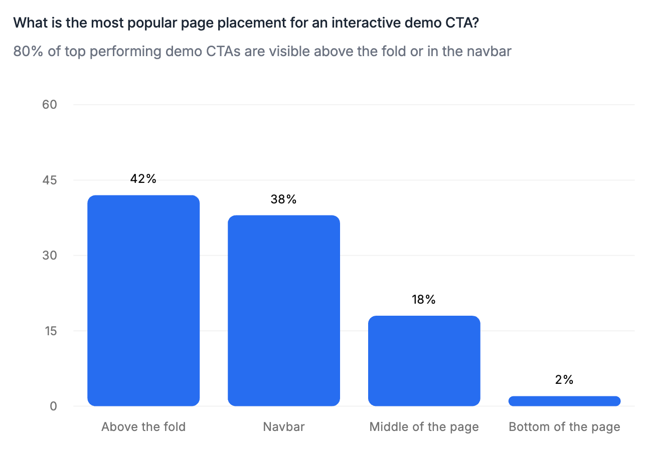
With a CTA
80% of top product tours are promoted with some kind of CTA above the fold on the homepage or in the site navigation.
Clicking the CTA will open up an interactive demo, either in a pop-up window or a new tab.
A select few companies embed their demos (16%) on their websites directly, and some even embed and link out to their demos (14%).
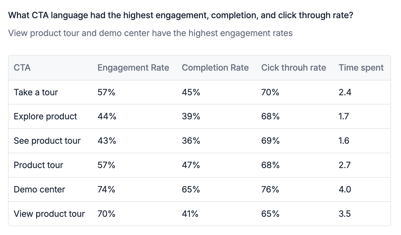
The most common CTA text is “Take a tour” (28%), followed by “Explore” (18%), “See product” (14%), and “Product tour” (14%).
Engagement, completion, and click-through rates are highest for “Take a tour” and “Product tour” CTAs.
Best Practices for first building an interactive demo
This past year, AI has dramatically sped up demo creation. Here's how the top demo builders use it to their advantage.
They Start By Identifying Aha Moments
AI can create demos for you, but it doesn't necessarily know what the most critical parts of your product are to highlight.
So before they ever start building, the best demo creators pinpoint 2 to 3 “aha moments” – where users see the most value in your product – to showcase in their demo.
If you’re not sure what these might be, we recommend:
- Talking to your CS, sales, or product team to find out.
- Loading call transcripts into an LLM and asking it to find the parts of conversations where prospects really lit up.
- Gathering blogs, docs, slides, one-pagers, and landing pages that speak to the product or feature you’re building your demo around, so that you can feed them into an AI Copilot.
Having these resources upfront provides demo automation tools with the right context. Plus, having your aha moments top of mind can help you customize AI’s output faster.
Then, They Use an AI Copilot to Create a Draft
It’s hard to come up with a demo outline from scratch, even if you know what aha moments you’re shooting for.
To make demo building faster and easier, many demo builders use a tool with an AI “copilot” feature that drafts the story for them.
Navattic’s AI Copilot, for example, writes demo copy, anchor tooltips, and crafts a demo story based on content you’ve already created, like:
- Click-throughs of your product
- Technical documentation
- Previously built demos
- Help articles
It also automatically incorporates the best practices we’ve documented in our State of the Interactive Product Demo reports, along with company style guides and product messaging.
Finally, They Edit and Polish
If demos are going on the most important pages of the website, they have to grab and hold people’s attention.
Our data shows that the top-performing demos:
- Are relatively short, between 5 and 13 steps. The flows with the highest completion rate are even shorter: between 1 and 6 steps.
- Don’t have a lot of words. Just 25 to 30 per dialog box.
- Use muted colors. Dark, neutral dialogs tend to produce better results.
Once they’ve got their AI-drafted demo, builders review it themselves to make sure their demo feels clean, crisp, customized, and up to date – then use AI to edit it.
With Navattic’s Copilot, for instance, they can:
- Edit specific elements, like text, charts, or tables, in bulk.
- Find and mass replace old dates hiding in your Captures.
- Save, reuse, and personalize demos you create.
5 Tips to Take Your Interactive Demo to the Next Level
1. Optimize Your CTAs
Top interactive demos have an average of 5 CTAs, which appear after every 1 or 2 steps.
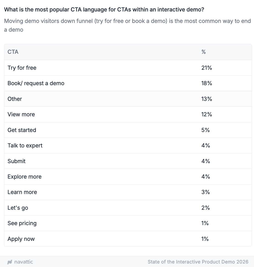
Top demos also use CTA language that nudges people toward conversion. 21% use “Try for free” and 18% use “Book a demo” to move visitors down funnel.
If you’re not getting high click-through rates, try A/B testing one of these CTAs versus your current one(s).
You may also need to adjust your CTA button color.
Our data shows that 45% of top demos use neutral CTA buttons (aka black or white). The rest use standard trust and action tones, like blue and yellow.
Need help with your copy? Read High Converting Interactive Demos Tips from a Copywriting Expert.
2. Let Users Choose Their Own Adventure
Not all buyers are looking for the same things out of your tool. And if you show them one or two things they’re not super interested in first, you may lose their attention.
Consider adding a checklist to organize multiple flows.
That way, visitors can skip to the parts of your product that interest them most, rather than having to sit through features they don’t really care about.
In our 2026 data, we found that multi-flow demos had 48% higher completion rates than single-flow demos.
3. Ungate Your Demo
Gating your demo can be tempting. After all, you want to know who is going through your demos, right?
But there are multiple other ways to get that information, and gating from the get-go can turn off potential buyers.
A majority (66%) of top demos are ungated. These demos have 6% higher engagement and 7% higher completion rates.
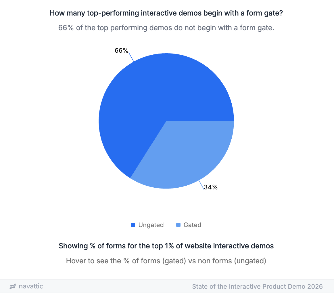
Of the top demos that do gate their demos, 75% collect only one field. And most of those gates appear at the end of the demo – 45% of forms are the last step.
To capture information about potential customers, 88% the top 1% of demos use Navattic JS, a tracking script you can install on your website to connect demo visitors with other available data from your marketing site.
Want to learn more about the pros and cons of gating? Read Should You Gate or Ungate Your Interactive Demo?
4. Guide Users (Without Guiding Them Too Much)
Give users too much to look at, and they’re too overwhelmed to see what’s special about your product.
Give users too little context, and they won’t grasp what your product does or just how much ROI they could get from it.
To strike a balance:
- Use modals as your first step. 71.9% of top demos start this way.
- Address users. 29% of top demos use “you/your” language. Even better if you personalize them. Here’s how to do it en masse for ABM campaigns.
- Use beacons to draw the eye. 24% of top demos include visual indicators to pull users’ attention to key areas.
5. Refresh and Iterate on Your Demos
Your product is always changing, which means your demos have to change, too. You’ll have to update them when you:
- Add new features
- Update your UI
- Change your messaging
We recommend reviewing your demos with each product release or at least blocking time to review them every quarter.
When you do your refresh, you’ll also want to double-check how your demos are performing and see if there are any tweaks you can make to boost engagement and completion.
Take a look at:
- CTA clicks. Is the copy relevant? Is it pushing them toward the next step you want them to take? Try adjusting your current demo or email cadence to improve adoption and follow-through.
- Drop-off points. Go through the demo yourself to see if all the steps and transitions make sense. There may be spots that are mislabeled or cause confusion among users.
- High-intent signals. Are those leads flowing directly to your reps? The second most common integration in top demos is with Slack (33%), so AEs can tailor their communication and follow up with leads quickly.
Stuck? Reach out to us at support@navattic.com to schedule a demo review or contact one of our Navattic demo consultants for assistance.
Measuring and Optimizing Interactive Demo Performance in 2026
Just like any other GTM asset, you want to be tracking your interactive demo performance to:
- See what’s working, so you can do more of it.
- See what’s not working, so you can fix it.
Here are several KPIs to pay attention to in Navattic Analytics, along with benchmarks for the top 1%, 10%, and 25% of demos.
Note: If you’re new to demo building, start at the top 25% benchmarks. Then work your way up to 10%, and finally to 1%.
Want to get more granular? Benchmark against companies of the same size in the same industry here.
Engagement Rate
What it is: Unique Engaged (users who make it past step one of the demo) / Unique Visitors (all unique users who viewed the demo)
Benchmarks:
| Top 1% | Top 10% | Top 25% |
|---|---|---|
| 56% | 53% | 55% |
High engagement is a signal of high intent.
If users are clicking through the first step, they’re at least somewhat interested in your demo (and your tool in general).
Completion Rate
What it is: Unique Completed (users who complete the first demo flow) / Unique Visitors (all unique users who viewed the demo)
Benchmarks:
| Top 1% | Top 10% | Top 25% |
|---|---|---|
| 48% | 40% | 43% |
If users have completed your demo, you’re doing a good job of keeping them engaged. Particularly so if they click your CTAs.
Click-Through Rate
What it is: Unique Navigated (users who click on a CTA to an external link) / Unique Engaged (users who make it past step one of the demo)
Benchmarks:
| Top 1% | Top 10% | Top 25% |
|---|---|---|
| 71% | 32% | 29% |
As a reminder, most of the top 1% of demos have 5 or more CTAs. If your CTR is low, try adding more to increase the likelihood of a click.
Time Spent
What it is: Total Session Duration in Minutes (Average time user spends on a demo) / Unique Visitors (all unique users who viewed the demo)
Benchmarks:
| Top 1% | Top 10% | Top 25% |
|---|---|---|
| 2.2 minutes | 3.0 minutes | 3.9 minutes |
The top 1% of demos have a shorter session duration, but their demos are shorter. Flows with the highest completion rate are between 1 and 6 steps.
Want to see an example of an interactive demo A/B test? Read about our overview vs. segmented demos experiment.
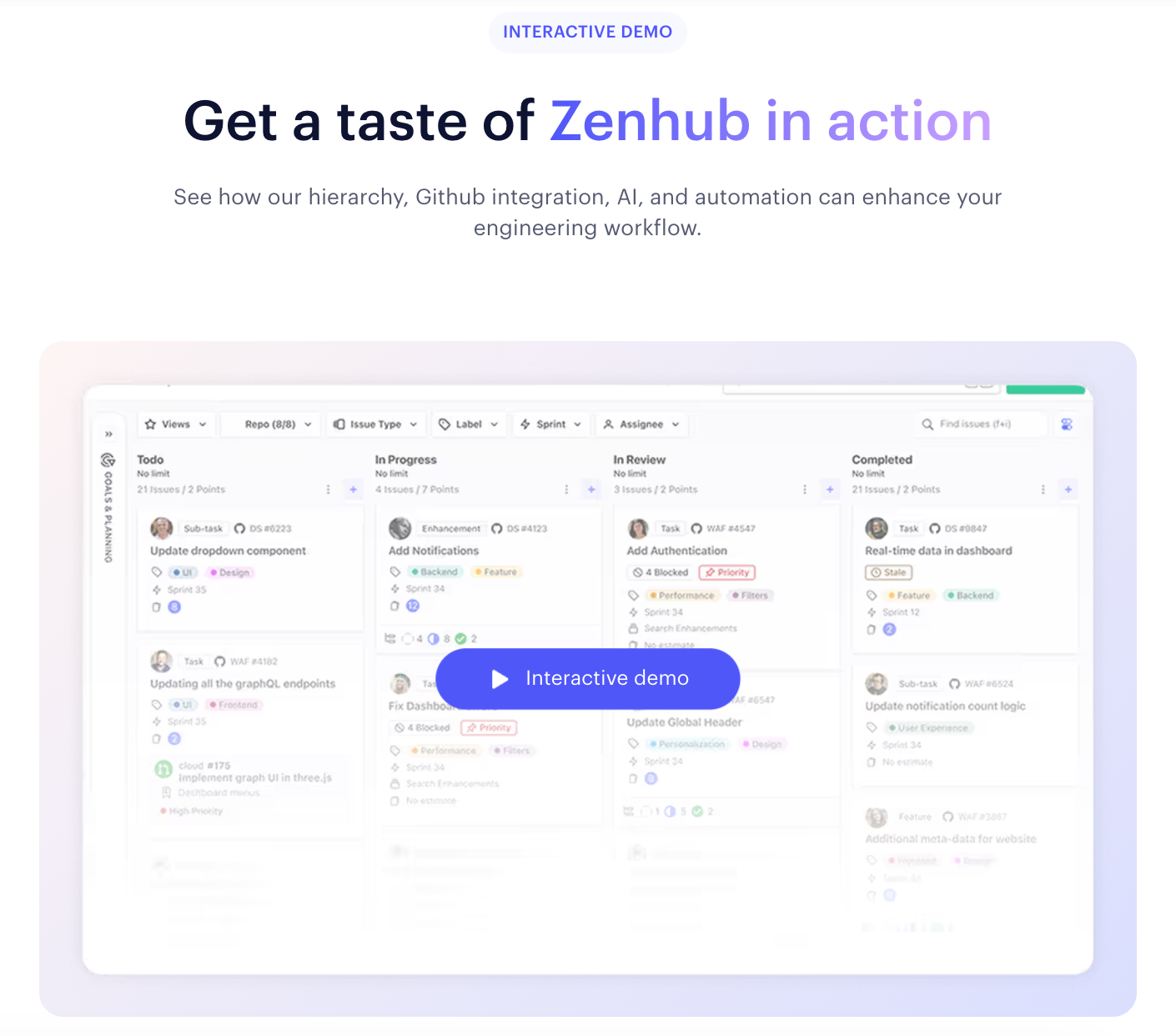
Top Interactive Demo Examples for 2026
Having stats to benchmark yourself against is helpful, but sometimes it’s easier to see these best practices in action.
Here are three examples of standout demos you can use for inspiration:
Notion
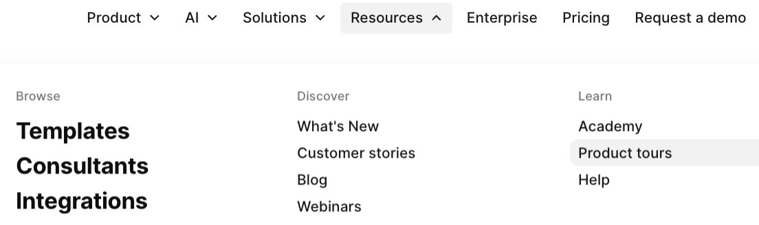
Like 44% of top demos, Notion organizes its demos in a demo center, which they call “Demo Hub.”
And like a majority of tours, you can find the Demo Hub in Notion’s website’s top navigation: Resources > Product tours.
You’re encouraged to dive into tours from the very top of the page.
Under the hero text, there’s a big CTA button: “Start the tour” – a flavor of the most common CTA text, “Take a tour.”
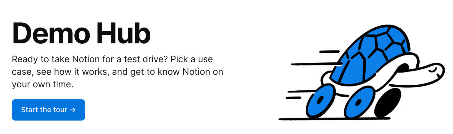
When users click that button, they’re dropped into a choose-your-own-adventure-style experience that combines all six demos into one tour.
With the checklist feature, visitors don’t have to go back to the Demo Hub to choose another tour after they finish one of them. They can view each part of the Notion product that interests them, all in one place.
The Notion team makes sure users know this with a sort of level-setting modal:
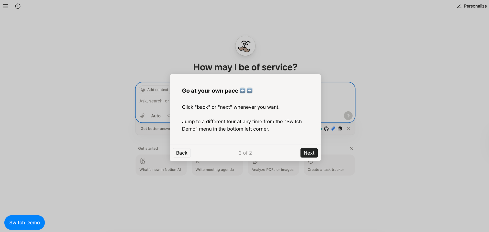
Users can either click through the demos in order or jump to whatever content they find most interesting by clicking “Switch Demo.”
Nearly all of Notion’s demos:
- Fit the 5-13 step range
- Use beacons to show users what to look at
- Use short, compelling sentences in each dialog box
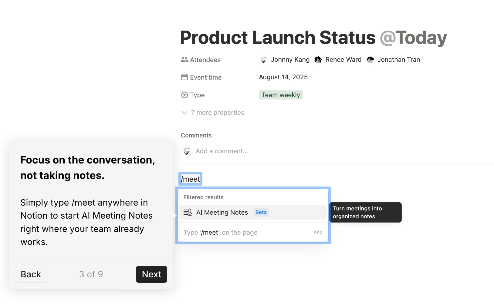
Right in line with what we see from the top 1% of demos.
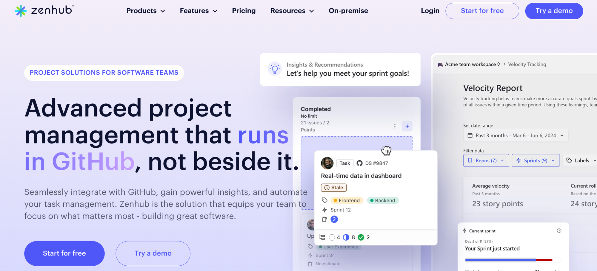
Zenhub
Zenhub has made interactive demos a core part of its website experience. Above the fold on the homepage, they have two prominent CTAs:
- One in the upper-right corner, a place normally reserved for a “book a demo” sort of CTA.
- One in the hero, right next to “Start for free.”
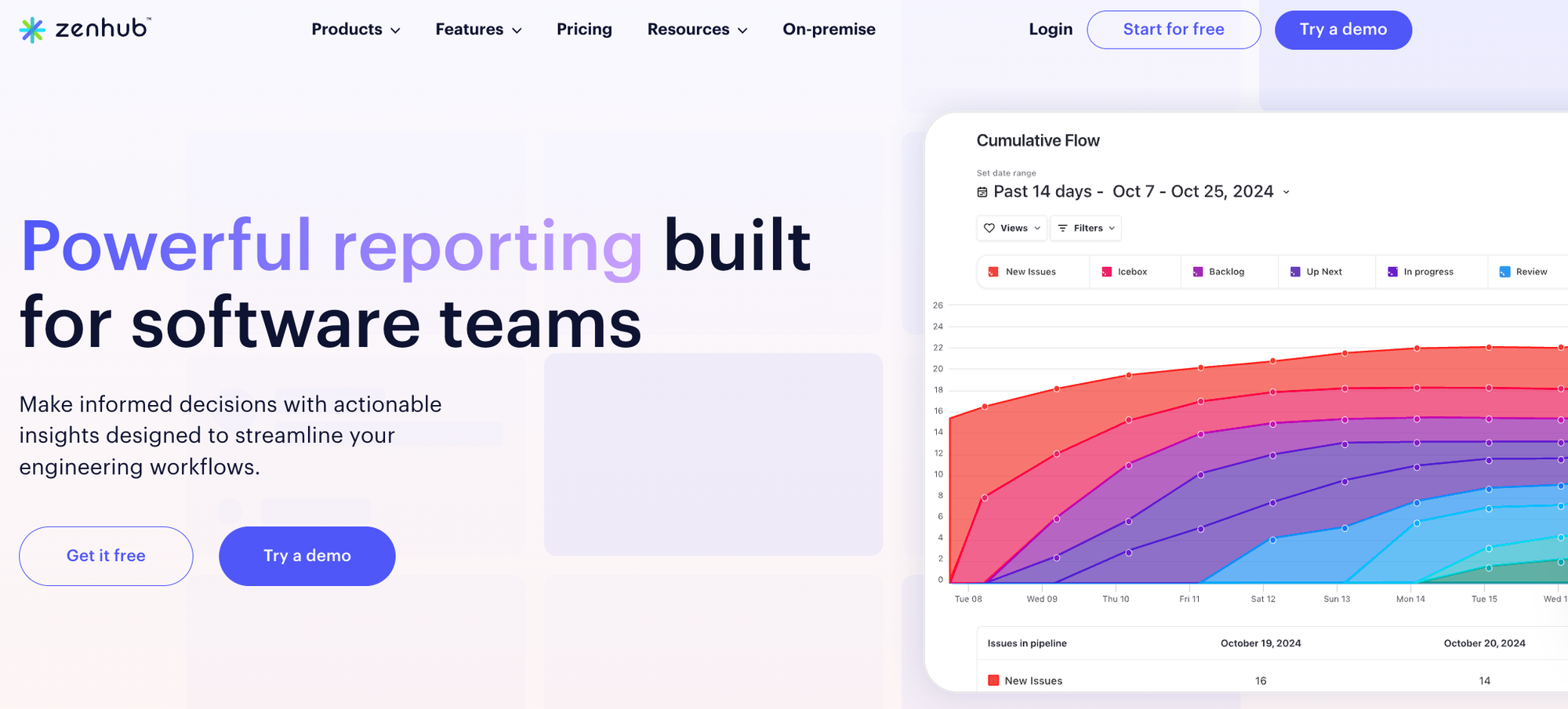
As visitors scroll down, they see another interactive demo embedded into the page:
The “Try a demo” CTA button reappears at the bottom of the page, too, reinforcing what Zenhub wants visitors to do: sign up or see the product firsthand.

The Zenhub team doesn’t stop there. The same CTA button pops up on their feature pages as well.
They’ve made their demo both impossible to miss and highly accessible:
- It’s got a checklist so users can try out four different features
- Most flows are within the top 1% range (5-13 steps)
- Beacons spotlight key actions they want users to take
- They add a CTA dialog box at the end that invites users to either “Keep exploring” or “Contact sales”
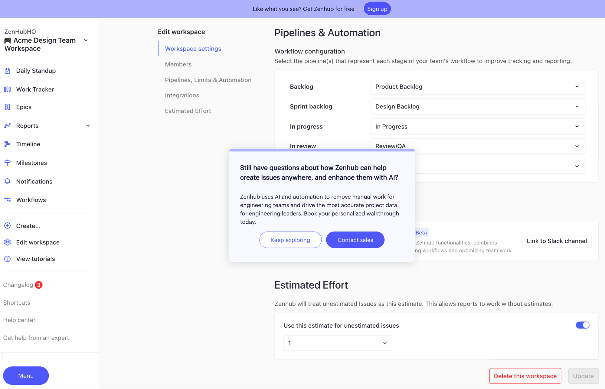
Zenhub even put a perpetual CTA at the top of their demo, urging people to sign up.
Want some more examples of great interactive demos?
Check out our Customer Showcase or watch our Show Don’t Tell Video Series with DemoDash.
Turn demos into deals.
Build interactive product demos that engage buyers and close deals faster.